What? You don’t think ecommerce product pages matter, do you? Well, think again. Remember the time you visited that one ecommerce website that featured only one photo of the item you wanted to purchase, very little information, and zero reviews?
Now, compare it to the other online store that is featuring not only multiple high-quality images along with detailed specifications, and customer reviews but even a video showing the product from different angles.
So, which of the two stores are you currently visiting?
Of course, the second one!
The thing is, oftentimes your ecommerce landing page becomes a key difference between a prospect converting and bouncing from your site.
And while building an online store, every page contributes to its success, the product page is undoubtedly the most important one. It becomes a deciding factor, whether to stay or flee.
Let us tell you a secret. Contrary to popular belief, the amount of traffic coming in never equals sales. That is, even if you found ways to increase traffic on your website, there is no way sales will increase at the same rate.
The key here is to optimize your online store for conversions because, without it, traffic will leak out of your ecommerce website without turning into sales. Relate it to pouring water into a leaky bucket and you will get the idea.
So, how exactly will you create a highly effective and optimized product detail page for your online store? Let’s find out.
Table of Contents
- 10 must-have things On your product page
- 1.Introduce a lifestyle
- 2. Respect the industry standards
- 3. Create good product images
- 4. Provide detailed product content
- 5. A clear call-to-action
- 6. Use customer ratings and reviews
- 7. Product suggestions (upsell and cross-sell)
- 8. Optimizing your page for mobile users
- 9. Easy to access guide and help
- 10. Allow syncing
10 must-have things On your product page
1.Introduce a lifestyle
Ever wondered why Instagram sales are increasing day by day? Because brands these days don’t just sell products, they sell lifestyles. And only you as an entrepreneur have the power to introduce the full concept and influence of your product presentation strategy.
So, when you build an online store, aim for creating the context, real-life dynamics, and the emotions that will strengthen the relationship between your brand and the customer.
Just remember, people, get inspired by outfits and lifestyle images. It's much easier to correlate with a person wearing a t-shirt than the t-shirt itself.
2. Respect the industry standards
Always consider the established interface patterns and mechanics while designing a product for the existing market. Use the layout that is already familiar with your users so they won’t have to learn a new UI.
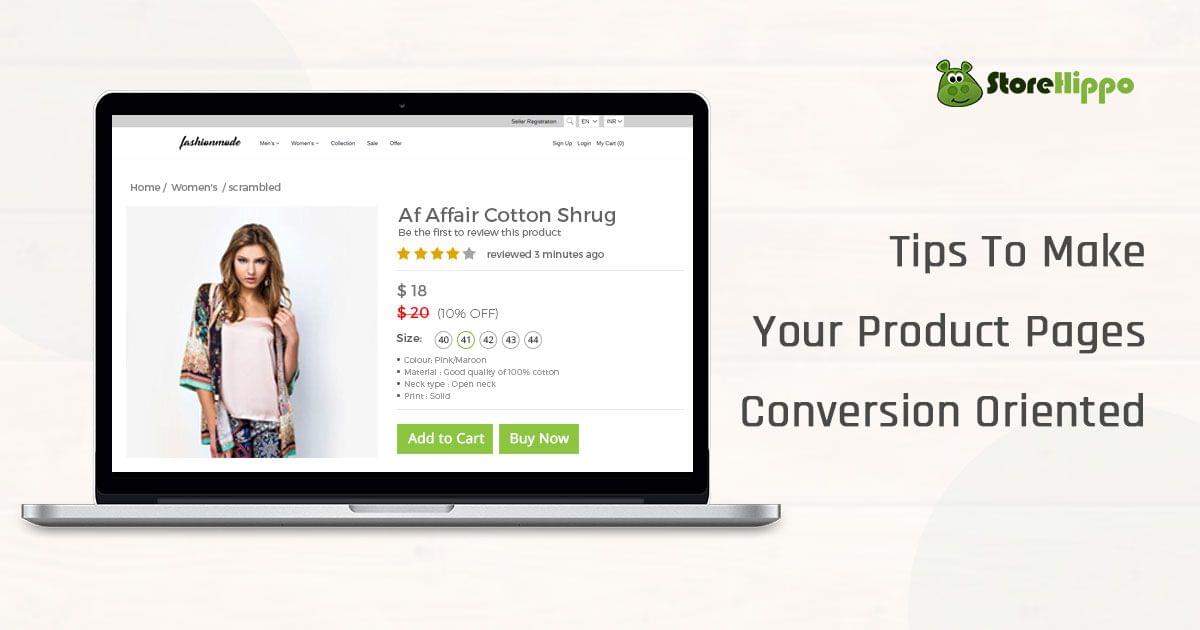
Currently, the average product page on an ecommerce website is generally divided into two columns i.e. photos on the left and product information on the right.
Now, sticking to this dual layout doesn’t mean all your product pages should look similar. You can still be creative with what you have got. After all, the sky’s the limit, isn’t it?
3. Create good product images
Ever heard the phrase, “The first impression is the last impression”? It's about time you start implementing it on your product page. Give your customers an accurate and comprehensive demonstration of the products as well as its properties when you build an online store. Here are a few tips to help you out-
- Provide product measurements where possible.
- Show them either on a mannequin or on a model.
- Capture close-up details.
- Treat all product images consistently.
- Show a product both open and closed.
- Show products in scale.
- Give the option to zoom in for details.
- Show product images from different angles.
4. Provide detailed product content
Beyond product images, great product content should provide high-level information about the product. After all, it’s the content that will inform your customers about the benefits and features of products on your ecommerce website. The details it should include are-
- A relevant product title
- Its size, dimensions, and capacity
- Important features and components
- Price
- Material of the product
- Information about the brand
- Care and maintenance instructions
While writing a product description, make sure to use a polite, engaging and personal touch. Inform them not only of the benefits of buying the product but also why they should choose you over others.
5. A clear call-to-action
Featuring a call-to-action or CTA on your product page is another important must-have when you build an online store. Also, make sure its a clear CTA, you don’t want people to miss out on that, do you?
The thing is, if you want people to buy, you should tell them what they need to do next. Also, it’s better to avoid using any fancy CTAs and use direct phrases such as “buy now” or ”add to cart”. And make sure the colour you use makes your CTA button highly visible on your product page.
6. Use customer ratings and reviews
Product reviews and ratings build trust towards your ecommerce website besides using this trust to help increase conversions. If your prospects had any doubts about your product earlier, online reviews can clear them away and help them reach a purchasing decision.
The only way for people to analyze online products is by checking what previous owners have to say about them. Thus, by putting up social proof in the form of reviews and testimonials, you are actually speeding up the buying process.
7. Product suggestions (upsell and cross-sell)
When you build an online store to sell products, you learn quite a handful of things about customer behaviour. Things such as, whenever they view a particular product, they will check out other related products too. At the last moment, they might want a different style or colour or size.
So, if you recommend other products to your customers and give them the option to compare, your chances of closing in on sales increase.
8. Optimizing your page for mobile users
Even without us telling, you already know that your ecommerce website needs to be mobile-friendly in order to stay competitive in today’s market. So, let’s skip that part and show you some considerations for your mobile product pages.
- Reduce the size of your images for easy and quick downloading. Also, avoid using too many third-party plugins.
- Make your images in front and centre. You don’t want any information getting in the way of images.
- Use a fix menu bar to allow easy access to the main menu, search bar and cart when you build an online store.
9. Easy to access guide and help
Once you start dealing with the online store, you get to know the number of ways your customers can get frustrated. One among them is not being able to interact with the product.
That’s why it is highly recommendable to add a live chat feature. If not, at least add a detailed Question and Answer section.
Apart from this, make sure to display clear information about the Size Guide, Prices and VAT, Warranties, Shipping Fees and Refund Policy on the product page of your ecommerce website.
10. Allow syncing
Often times, it’s seen that customers view a product on their mobile and then switch to the laptop or desktop to make the purchase or vice versa. By allowing syncing between devices, you can easily rule out this inconvenience.
Begin with helping them understand the benefits of signing up in order to sync their bag and wishlist. Also, make sure the sharing options (including individual items and whole bags) are placed where they are easily visible when you build an online store.
And with this, our list of ten must-have things on the product page of your online store has come to an end. We hope our tips were useful for you. Feel free to share and check out our other in-depth articles on our blog page.
We at StoreHippo help entrepreneurs build next-generation ecommerce stores that are equipped with advanced tools and features to help you create your niche in the ecommerce arena. So, if you are looking to build an online store or have any related queries, book a demo with StoreHippo and let us help you out.


Leave A Comment