The very famous saying "The first impression is the last impression" is also quite relevant in the ecommerce world.
Believe it or not but it holds true even for an enterprise ecommerce store.
You guessed it right!
The first thing customers would notice once they land on your enterprise website is the store's design, look and feel. Naturally then, creating conversion-oriented and engaging store designs is one of the top priorities for enterprise brands.
But, ever wondered, how enterprise ecommerce brands manage to design visually appealing store designs that can help boost their sales? Do you know what elements are needed to design a conversion-oriented store?
Let's find out.
Table of Contents
- Why Enterprise brands need conversion-oriented store designs
- 4 elements to ensure a great enterprise ecommerce store design
- Why brands need to build an engaging enterprise ecommerce website
- Understanding Customer Behaviour For Building Engaging Enterprise Ecommerce Stores
- Building conversion-oriented enterprise store designs made easy with StoreHippo
- 5 StoreHippo features that help in building a conversion-oriented enterprise ecommerce store
- Conclusion
Why Enterprise brands need conversion-oriented store designs
Enterprise ecommerce brands need to build a rapport with their customers right from the word go. For achieving this, they need to build conversion-oriented store designs that focus on delivering a great user experience and are optimized for search engine ranking. The goal is to increase traffic to the site and convert more visitors into paying customers. A conversion-oriented store design takes into account all aspects of the user experience, from the navigation and layout of the site to the checkout process. And, to create an online store is not just about putting up products and services for sale, it's about building a brand, connecting with customers, and delivering a great user experience.
Moreover, the design of your store plays a vital role in creating a great user experience.
It should be visually appealing, easy to navigate, and mobile-friendly. Your store design should reflect your brand identity and convey the message you want to send to your customers. It should be able to grab the attention of your target audience and make them want to stay on your site and explore more.
A good design can help you in various ways, such as:
It will ensure that the customers stay on your site for longer
The overall look and feel of the store will be quite impressive, creating a good perception for your customers
A great design can help you build trust among your potential customers
4 elements to ensure a great enterprise ecommerce store design
Additionally, a few elements make a store design great and conversion oriented. They are:
1. Use of whitespace
Whitespace is one of the most important aspects of a well-designed store, and it makes sure that the store doesn't look cluttered and overwhelming to the customers.
Using whitespace correctly can help make your store look more spacious and organized.
2. Use of high-quality images
Using high-quality images when brands create an online store is another important aspect of designing a great store. The images should be well-lit and clear, and they should also be relevant to the products that you are selling. Using high-quality images can help you in making your store look more professional and trustworthy.
3. Use of colours
In the physical world, colours are said to impact our moods, and the same goes for the online world. Creating an ecommerce store design with a colour scheme that reflects your brand identity can help you in creating a good impression and brand recall factor.
4. Use of fonts
Just like colours, fonts also play a very important role in the overall look of your store. Using the right fonts can help you in making your store look more professional and trustworthy.
So, these are a few elements that you must remember while designing a conversion-oriented store design. Keep these things in mind, and you will be able to create an online store with more appeal to enterprise ecommerce businesses.
StoreHippo online store builder offers a range of features that can help enterprise brands create conversion-oriented store designs. Our platform is fully customizable, so you can create a unique user experience that matches your brand identity.
Why brands need to build an engaging enterprise ecommerce website
The term engagement is self-explanatory. It is the level of involvement that a person has with a certain task, product, service, or activity. In the online world, engagement is usually measured in terms of time spent on a certain website or web page. The more time a person spends on a certain website or web page, the more engaged they are with that particular site or page and the easier it is for the enterprise brand to nudge them towards conversion

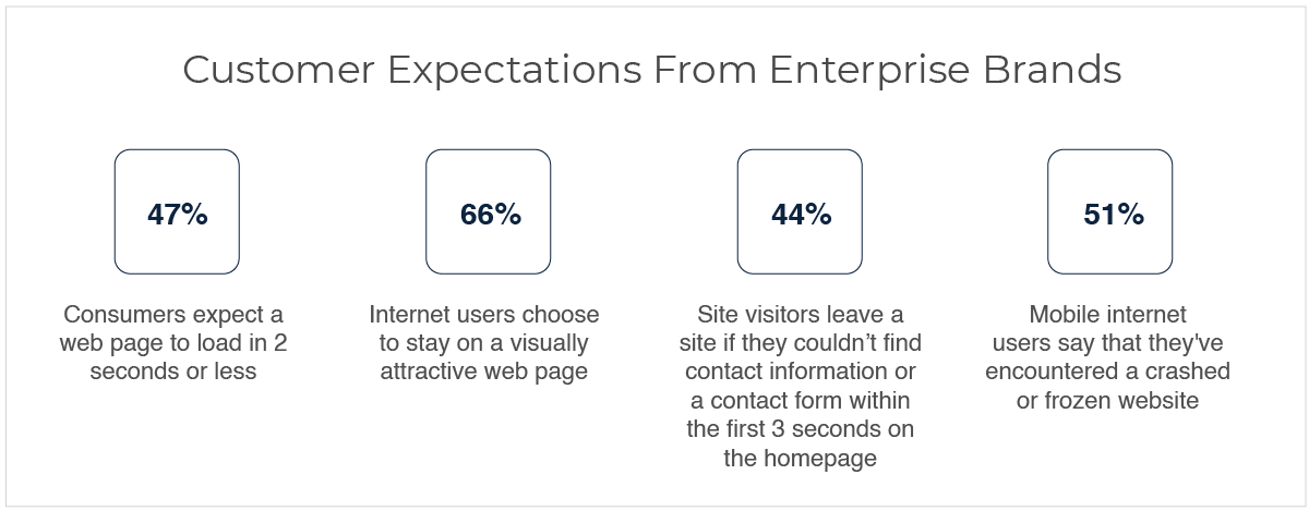
47% of consumers expect a web page to load in 2 seconds or less
66% of internet users choose to stay on a visually attractive web page
44% of site visitors leave a site if they couldn’t find contact information or a contact form within the first 3 seconds on the homepage
51% of mobile internet users say that they've encountered a crashed or frozen website
Source: Neil Patel, AMBERD.
Well, it's clear, buyers are impatient, and they will stay loyal only if your brand builds an instant connection and offers a seamless buying experience.
Understanding Customer Behaviour For Building Engaging Enterprise Ecommerce Stores
To boost engagement, brands need to know what annoys their customers. There are many reasons why visitors might leave a website. Some of the most common reasons include:
They couldn't find what they were looking for: If a visitor can't find what they're looking for on your website, they'll likely leave and go to a competitor's site that has what they're looking for
Your website is too slow: If your website takes too long to load, visitors will likely get frustrated and leave
Your website is not mobile friendly: With more and more people using smartphones and tablets to access the internet, it's important that your ecommerce website design is feasible for mobile devices. If it's not, visitors will likely leave
Your website is not attractive: If your ecommerce website design is not visually appealing, visitors will likely leave
There's too much clutter: If your website is cluttered and difficult to navigate, visitors will likely leave
You're not providing enough value: If your website doesn't offer visitors anything of value, they'll likely leave
Building conversion-oriented enterprise store designs made easy with StoreHippo
Engagement is important because it is a good indicator of how interested and involved a person is with a certain web page or ecommerce website design. The more engaged a person is, the more likely they are to take some action on that site or page.
Some common actions that people take on websites or web pages include making a purchase, signing up for a newsletter, or filling out a form. Therefore, engagement is a good way to measure a website's or web page's success in generating conversions.
StoreHippo eases the job of B2C and B2B enterprise ecommerce brands by providing them with a platform that is loaded with features necessary to build a conversion-oriented store design.
Here are a few tips that our team of experts suggest:
1. A strong first impression
The first thing is to keep your store's design simple yet attractive. Complex and cluttered store ecommerce website design will only confuse and frustrate visitors, leading to them leaving your site without taking action.
Simple, think like this, would you buy from a store which is confusing and doesn't make it easy for you to find what you're looking for? No, right? This is why a well-designed store, on the other hand, will make it easy for visitors to find what they're looking for and easily navigate your site. Opt for a clean and simple design that is easy to navigate and makes it easy for visitors to find what they're looking for.
2. Use persuasive copy and CTAs
Your enterprise ecommerce store’s web copy should be persuasive and convince visitors to take the desired action. Clickbait headlines and cheesy sales pitches will only serve to turn visitors away. Instead, use persuasive copy that is well-written and convincing. This will help to persuade visitors to take the desired action, whether it be making a purchase, signing up for a newsletter, or filling out a form.
Since numbers, addresses, and emails play an important role in the process of persuasion, so make sure to include this information prominently on your website.
3. A pinch of testimonials and reviews works wonders
A good review means a good amount of revenue for your enterprise ecommerce brand. A study found that 84% of consumers trust online reviews as much as personal recommendations. This just goes to show how important reviews and testimonials are in consumers' decision-making process.
In fact, in today's time, many people take to the internet to read reviews and testimonials before making a purchase. Therefore, when you create an online store for your enterprise business it's important to include reviews and testimonials on it. These can be in the form of blog posts, social media posts, or even video testimonials.
4. Attractive visuals
Who doesn't love visuals? We, humans, are naturally drawn to visuals, so it's important to use them on your enterprise ecommerce website. 93% of consumers say that product photos are "very" or "extremely" important in their purchase decision. High-quality product photos will help to persuade visitors to buy your product.
In addition to product photos, you can also use visuals such as infographics, charts, and graphs to explain complex concepts in a simple and easy-to-understand way.
5 StoreHippo features that help in building a conversion-oriented enterprise ecommerce store
So far, we have discussed what goes into building a conversion-oriented enterprise website and how important it is for enterprise ecommerce brands. Let's now take a look at some of the features offered by StoreHippo that will help you to create an online store designed for success:
.png)
1. Personalized Landing Page
The landing page is the first thing visitors see when they visit your website. This is the most important page where you need to nail your ecommerce website design., Your landing page design can either make or break the user's experience. It would be best to consider several things when designing your landing pages, such as the layout, colours, images, and copy.
With this, you must also ensure that your landing page is mobile-friendly and responsive. One of the best ways to encourage users to take action on your landing page is to personalize it by displaying relevant products, offers, and content based on the user's location, interests, and behaviour.
A well-designed landing page can help to persuade visitors to stay on your site and take the desired action. For example, suppose you own an ecommerce clothing business, and you're running a sale in the women's clothing section. In that case, you can create a landing page specifically designed for female customers.
How does a compelling landing page help in conversions
The homepage should be designed to focus on conversion, with proper CTA(Call To Action) buttons and easy navigation
The first layout of the page should be such that it is easy for visitors to find what they are looking for
Page linkings should be such that it takes the visitor to the product page directly; there should be no dead ends
StoreHippo, built on the headless architecture, gives better creative control to developers and marketers of enterprise ecommerce brands to create a personalized landing page for your store.With our powerful mix-and-match theme support and drag-and-drop editor, you can easily add and customize elements on your page without compromising the loading time.
You can also create that social buzz and make your marketing message meaningful through personalized landing pages for different segments of your audience to increase conversions. Besides, we have tons of beautifully designed and ready-to-use themes for your enterprise ecommerce business.
2. Top-notch site speed
Google includes site speed as a factor for ranking websites. And it's not just Google. Faster sites lead to happier users and higher conversion rates.
Did you know, "a 1-second delay in page response can result in a 7% reduction in conversions."
That means, if you're not paying attention to your site speed, you will eventually be sending your customers to your competitors. Also, a slow website will not only frustrate visitors but lead to lower search engine rankings and less traffic.
When you create an online store, maintaining a site load speed of less than 3 seconds helps engage customers better. Fast-loading sites are known to result in faster checkouts.
Fortunately, the StoreHippo enterprise ecommerce platform is built for speed. We use multi-tier caching and SPA (Single Page Architecture) to build lightweight stores that load quickly. What's more, our platform is inherently scalable, so you can rest assured that your store will have the same performance even during high traffic volumes or when your products, sellers, stores etc. grow exponentially.
3. 360-degree product view
Products such as clothing, shoes, jewellery, appliances, gadgets etc. need to be seen from all angles for customers to make an informed decision. Because when customers are shopping online, they can't physically touch or try on the product. And even when shopping on trusted enterprise ecommerce stores, they want to be sure that they're getting exactly what they're looking for.
This is where a 360-degree product view comes in handy. With this feature, shoppers can see your product from all angles, and they can even zoom in to get a closer look. This way, they can be sure that the product is exactly what they're looking for before they make a purchase. Adding 360-degree product view and videos go a long way in boosting orders and also help in reducing returns and refunds.
With StoreHippo, you can easily add a 360-degree view of your products in your ecommerce website design. You can also add videos to give a detailed idea of your products, how they function (in the case of gadgets or appliances), what is the quality, touch and feel etc. StoreHippo gives you the option of product swatches, customer reviews etc. which further enhance the shopping experience of your buyers and help build conversion-oriented product pages.
4. Seamless buying experience on different devices
One of the most important things to consider when building an enterprise ecommerce store is the user experience. After all, if your shoppers are not happy with their experience in your store, they will not make a purchase. And one of the best ways to ensure a positive user experience is to ensure that your store is responsive.
A responsive design is an approach to web design that makes web pages render well on different devices and screen sizes. So, whether your shoppers use a desktop computer, a tablet, or a mobile phone, they can view your store correctly. And since more and more people are shopping on their mobile phones, it is essential to have a responsive store. And with StoreHippo, you don't have to worry about responsive design.StoreHippo enterprise ecommerce platform is designed to provide a seamless experience on all devices. Built grounds up on the mobile-first principle, StoreHippo ensures your customers get the most engaging buying experience irrespective of the device they are using.
All stores powered by StoreHippo can be turned into PWAs in a few clicks. Offering PWA stores ensures seamless browsing and buying experiences even on entry-level devices and slow internet connections. When your ecommerce website design offers a seamless experience to your buyers across devices, they inadvertently engage more often with your enterprise brand and remain loyal customers buying frequently.
5. Multilingual themes
Another important factor to consider when building a conversion-magnet enterprise ecommerce website is to make sure that it is accessible to users in their native language. The average online shopper is not comfortable purchasing in a foreign language. By supporting multiple languages, you indicate that your brand is international and trustworthy. This small change in your store design will help you to target a wider audience and boost your sales.
For example, if you are an enterprise spice merchant and your target audience is the Middle East, UAE and other gulf countries, you can boost your orders simply by implementing RTL (right-to-left) Arabic, Hebrew, Persian, and Turkish languages on your website.
At StoreHippo, we understand the importance of catering to a global audience, and that is why we offer multilingual themes and exclusive support for right-to-left (RTL) and other languages. The translation support in StoreHippo allows you to easily translate your store into multiple languages and create a multilingual ecommerce website design.
With the StoreHippo enterprise ecommerce platform, you can translate static as well as dynamic content into 100+ languages. From your product descriptions to the home page, to the buy button and error messages, all can be translated into the chosen language of your buyers.
You can also implement rule-based automatic translation, showing language based on the user’s location. Reports suggest a 5X+ boost in conversion rate for enterprise stores that implement multilingual ecommerce website design. It is fairly evident that aligning your store with your customers' preferred languages sure pays rich dividends.
Conclusion
Your enterprise ecommerce brand is unique, and your ecommerce store should be too. With StoreHippo, you can create an online store that is an exact reflection of your brand identity. What’s more, our platform is designed to give you the power and flexibility to grow your business the way you want.
So whether you’re just starting out or are ready to take your business to the next level, StoreHippo is here to help. Apart from the above-given features, StoreHippo also offers 300+ built-in features a rich, device-optimized, customizable themes library to help you build your dream store in no time. Built on MACH architecture, StoreHippo gives you the flexibility and creative freedom to create WOW ecommerce website designs in no time. So what are you waiting for?
Start building your enterprise ecommerce store today. Get started with your 14-day free trial now.


3 Comments
Leave a Reply
Leave a Reply
Leave a Reply